The best statistic to look at when considering the level of industrialization of a nation is not manufacturing’s share of GDP or number of manufacturing jobs, but manufacturing per person. A simple scenario explains why; in it Tom earns $5,000 a year from accounting work and $20,000 from other sources, while John earns $2,000 from accounting and $2,000 from other sources. Who would you determine to be more of an accountant? If you focus on accounting’s share of income then John at 50% is clearly the bigger accountant. However, when looked at by accounting per person, Tom obviously does more accounting than John. The same applies for the reason why the number of jobs does not matter; who cares if Tom has 2 workers making the $5,000 while John uses 5 workers to make $2,000? When adjusted for manufacturing output per person, the following table shows how it stacks up: (manufacturing output is in billions, manufacturing per capita is in thousands, and growth is from 1996, all stats are from the CIA World Factbook or Economagic.com, I also use a 5 year average for currencies, so Europe's output is slightly lower and Japan's higher than a straight current currency conversion would yield)

As can be seen, despite everything you hear about China’s manufacturing destroying the U.S. industrial base, we still produce nearly 13 times as much industrial output per person as China. We also produce almost 5 times as much as the world’s average. We have the third highest per capita manufacturing of the bigger countries, behind only Japan and Canada. To counter the argument that we are de-industrializing, I also included the growth of these various countries over the last 10 years. The U.S. actually grew faster than the world average during this period, 18.3% vs. 12.9%. There are several reasons for that since our growth was only average. Japan's output (third highest in the world) barely grew, and non-Japan/China East Asia was slammed by the 1998 economic crises. That's why Korea underperformed overall and Indonesia's production declined significantly. Western Europe and Latin America (check out Mexico, so much for that giant sucking sound) also underperformed last decade. To be fair to us, we also had to deal with the 2000-2001 recession that saw our industrial production decline 8% before recovering in 2003 and growing 12.5% since then.
While there are some real issues in continental Western Europe with industrial output (only 4.8% per capita growth!), they are still 4 times higher than the world’s average per capita output. The reason China's growth is so high is that it is coming off of an extremely low base of $335 per capita in 1996. In the last 10 years we have increased our output by almost $1,460 per American where as the Chinese have increased theirs by $405 per person. China's growth will inevitably slow as they become more industrial (or when their environment gives under the intense pollution). Also, I would expect that like the Soviets, the Chinese overstate their output to some extent. The last point about this chart is that it shows again how the world’s power structure is shifting. Manufacturing is only one part of a nation’s power, but it is linked to economic performance which in turn determines defense spending and population development. The regions performing best are first non-Japan East Asia, then India, and third the Anglo-sphere. These are the regions that will shape the future; we had better prepare for it.
As a side note, last years per capita growth rates were America 2%, W Europe 0.1%, E Europe ~4%, Japan 1.3%, China 8.3%, India 7%, non-Japan/China East Asia ~5%, Latin America ~2%., and the World ~2%.

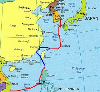


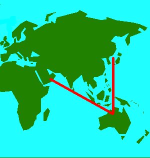


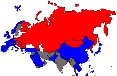
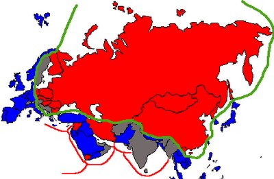
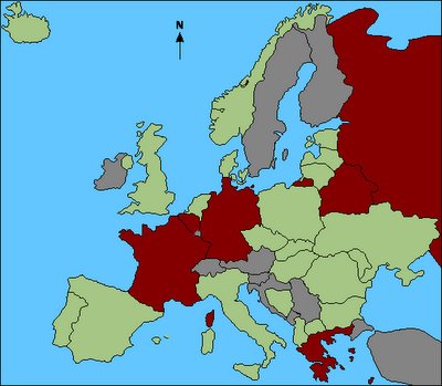
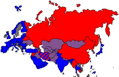 (Blue - Pro-U.S., Red - Pro-Russia/China, Gray - Neutral, Purple - Contested)
